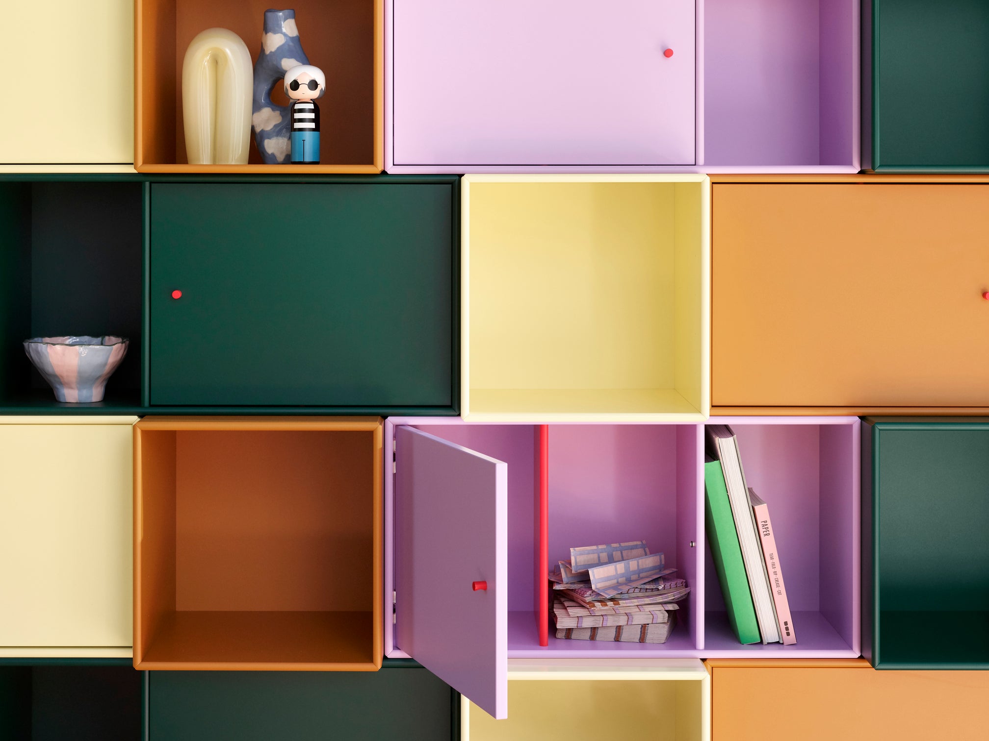
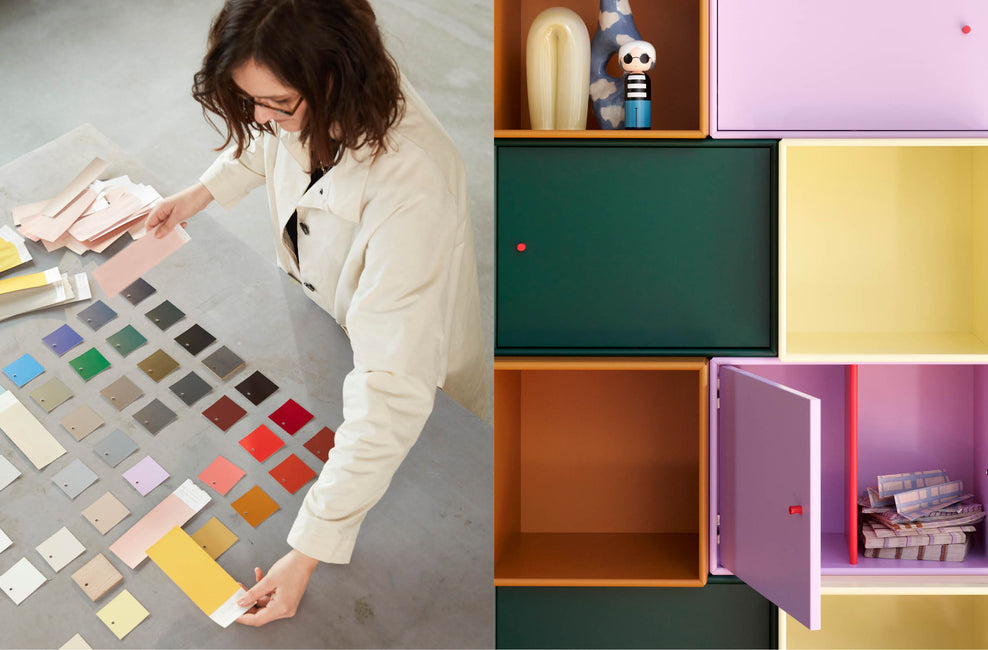
The Montana Colours — A colour palette of 43 poetic colours
A colour is no better than the company it is in
43 unique colours that make great company!
Montana’s functional and flexible system is featured in a range of 43 poetic and complex colours developed in close collaboration with the award-winning Danish designer and colour expert Margrethe Odgaard.
Colours mean everything. Ambience. Atmosphere. Identity.
Colours are paramount in Montana’s design. They want to influence and inspire the world of interiors with their take on colours. Bright and light. Dense and deep. There is a colour for any purpose.
Since 2007, we have exclusively used water-based lacquer colours, which neither smell nor contain solvents.
"Just as the modules offer infinite possibilities for combination, the colours also need to be able to be mixed and matched" - Margrethe Odgaard
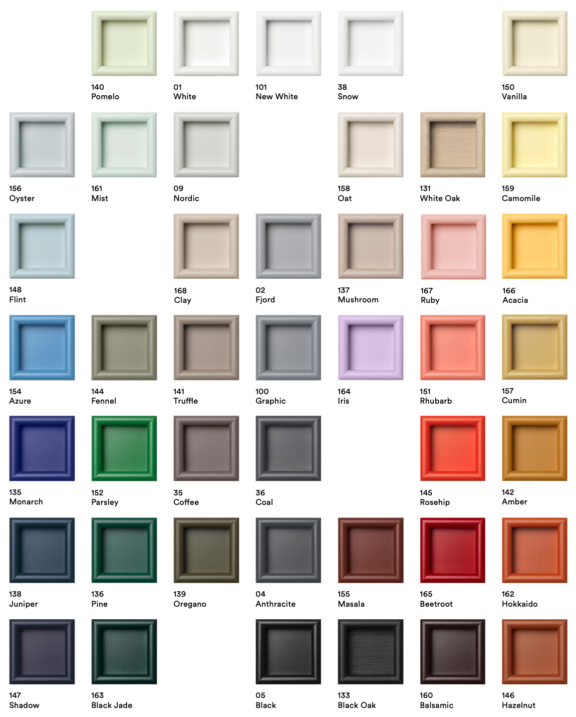
10 inspiring colour styles — which one suits you best?
The 43 colours in Montana’s colour palette give you endless possibilities to mix and match colours. Be inspired by Montana colour styles.
Choose the one that suits your personal style best, or pick and choose elements from the different colour styles to create something completely different and entirely you.
Maximum Memphis — Colour like there's no tomorrow

Starting with a base of white and black, we urge you to explore bold graphic expressions, geometrical shapes, and contrasting blocks of colour. Make room for a bit of white space for the eye to rest. And then get back at it with the piercing blue Monarch, the bright orangey-red Rosehip, and the mesmerizingly deep Azure.
Patterns at Play — A striking spin on traditional décor
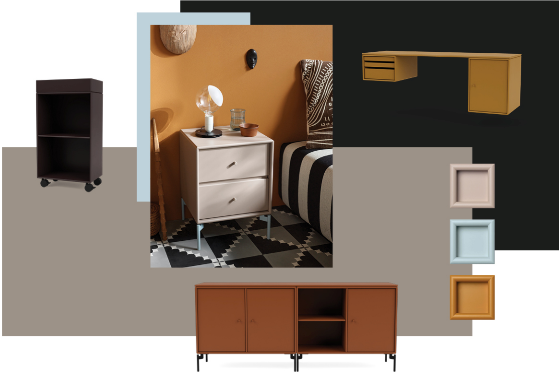
Watch how colours and patterns play in the light as brownish hues like Balsamic, Masala, and Hokkaido make the mind wander towards beautiful desserts, spice markets, and landscapes far away and pull it all back to the cold north with softer hues like Mushroom, Oat, and Amber – or the striking blue Monarch.
Less is Calm — Enjoy the serene zen of Japandi
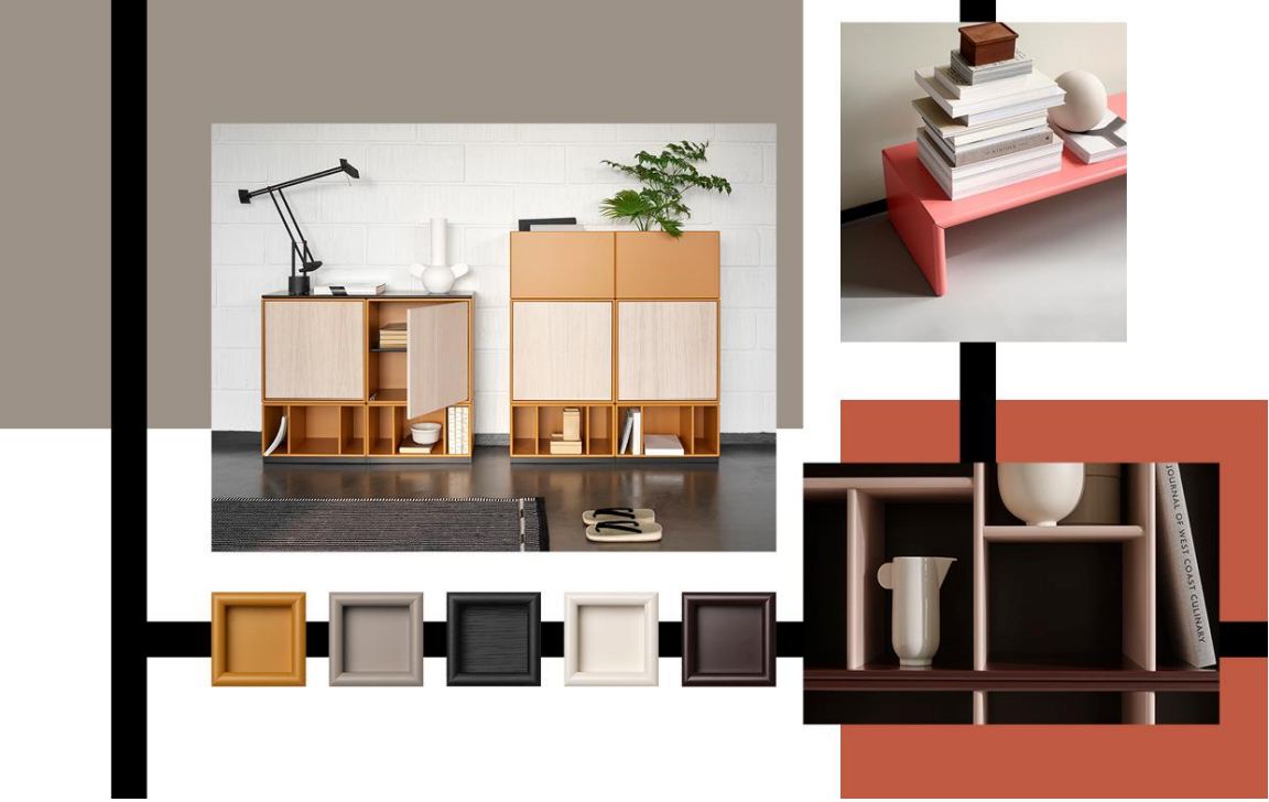
Dark and earthy tones, clean lines and a downplayed sense of pure well-being. The quietly beautiful Japandi style blends the very best of Japanese and Scandinavian décor traditions. Choose muted tones such as White Oak, Balsamic or Mushroom to create the base for this boldly simplistic look, and don’t be afraid to add a contrast colour like Hokkaido, Azure or Rhubarb.
Anything Goes — Embracing all the perfect imperfections
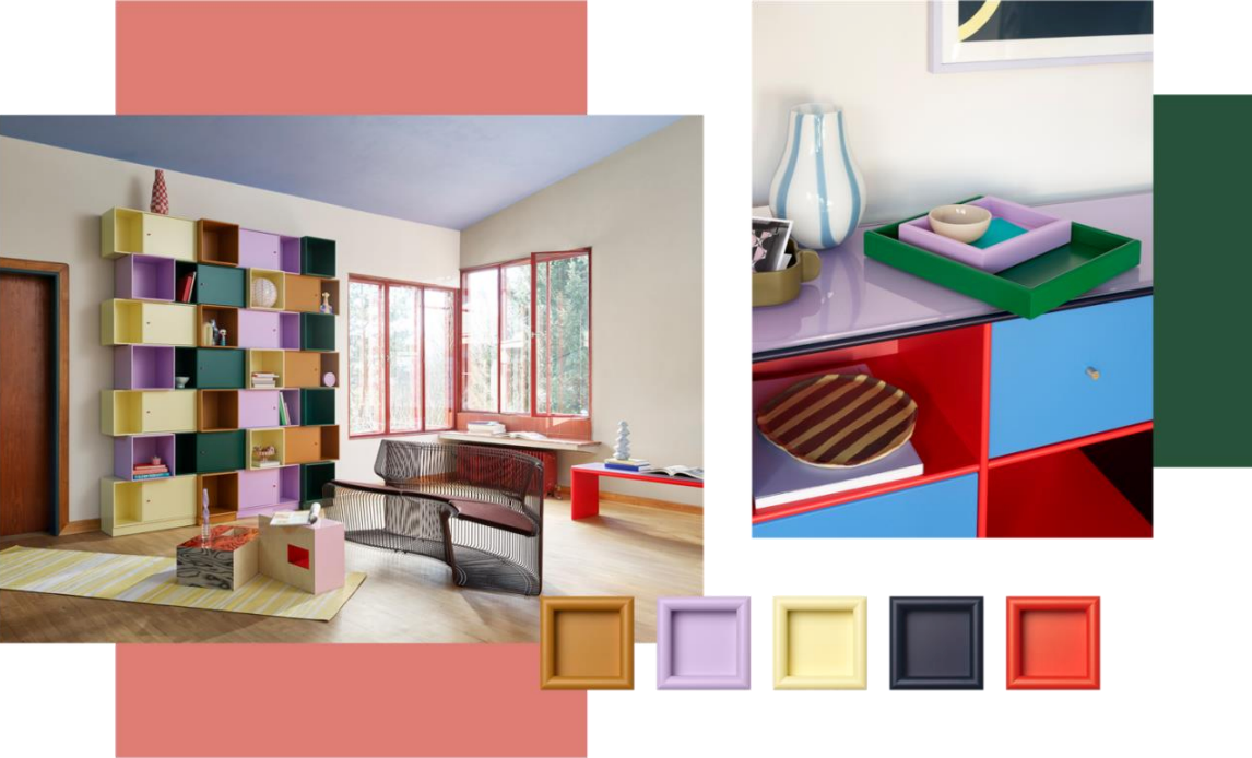
Step into a playful and passionate exploration of the place we call home. Eclectic patterns, bold choices, bright colours and loud laughs galore. Create a luxuriously positive ambience with Parsley and Monarch. Mix and match in whatever way you can possibly imagine. This is the place for good vibes, colour collisions, bold patterns and deliberate mismatches.
Playful Optimism — It's not furniture. It's art.

A homage to playfulness and possibilities – simple combinations of lines, angles, and primary colours. Colours are transformed by the company you keep them in – Montana's playful nuances of primary colours offer countless possibilities for cheeky combinations and artistic expressions of personality. Our tip: try mixing Hazelnut, Rhubarb, Amber, Vanilla, Azure and Rosehip.
Timeless Functional — Function is key, go for meaningfully different
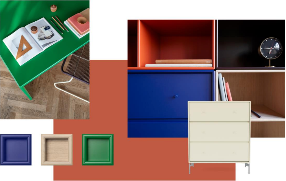
Primary colours juxtaposing earthy hues and natural, organic materials. Plants that grow and wood that breathes. Space, air and geometry – giving room for lofty thoughts. Let natural earth tones like Oregano, Shadow and Truffle meet classic primary colours like Roseship, Monarch and Parsley in a timeless expression of you.
Girly Blooming — A sweet floral romance with a twist of kapow
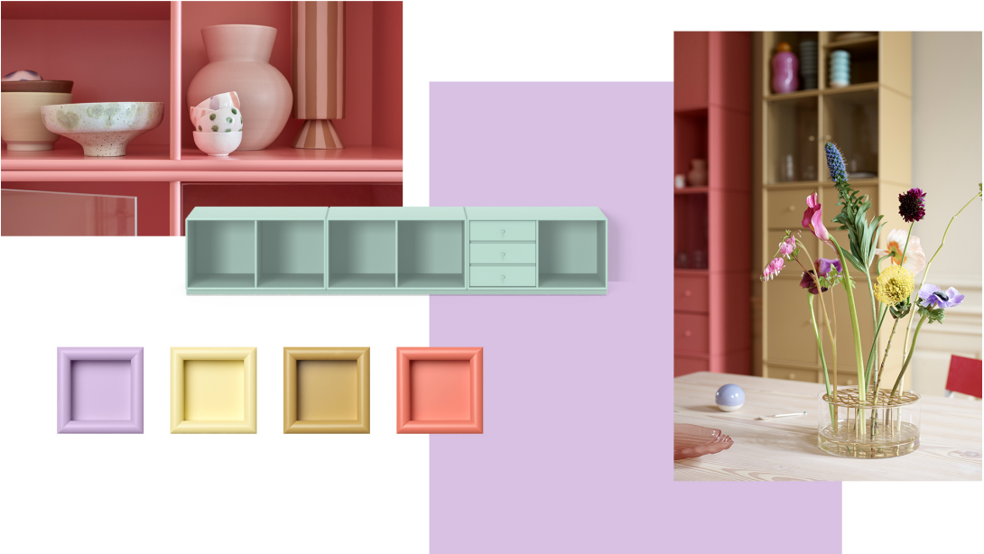
Fancy cocktails. Striking colourful dresses. Summer all year long. The bright and joyful tones can take you all the way from soft, floral romance – to loud, colourful kapow. Where you decide to go, is all up to you. Rhubarb, Cumin, Mist, Oat, and Iris all have a distinct dash of decadence that sparks a vibrant feeling of pure life. All colours are intertwined and closely related in the colour style Girly Blooming.
Block Colours — A little drop of crazy never hurt anyone
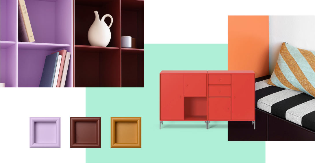
Step into powerful contrasts and strong, bright colours. Radiant spice markets with hues like Masala, Amber, Acacia and Camomile. Blending strong colours with muted tones will create the maximum punch. Like a welcomed kick in the eye on a grey day. Fill your home with a vibrant and energetic ambience: Monarch, Black Jade, Hazelnut, Iris and Balsamic are here to brighten up your surroundings.
Soothing Sanctuary — Cocoon in a comfortable way
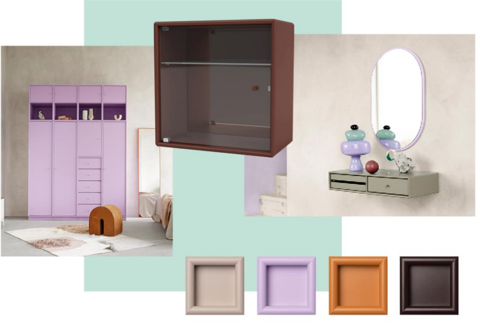
Airy rooms with a meditative mix of bright pastels and burnt shades. A juxtaposition of muted earthy tones - like Hazelnut, Balsamic, and Mushroom - and playful pops of pastels – Iris and Rhubarb. Stay calm – but feel invigorated. Mix and match as you please to find your personal expression of the perfect balance between calmness and charming charisma.
Natural Gradient — A warm embrace of nature
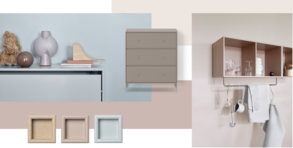
Soft organic gradients and natural materials in a calm, muted medley, eagerly waiting to embrace us all. Bring the outdoors in and create a calm, reflective atmosphere with hues like Mushroom, Truffle, Oyster and Masala. No matter the mix, they will serve as a steady base for all other naturals; leather, wood and luxuriant green plants.
Find the colour style of your dreams
Answer 10 simple questions about colour, style and interior. Find out what style to strive for to create your dream home.
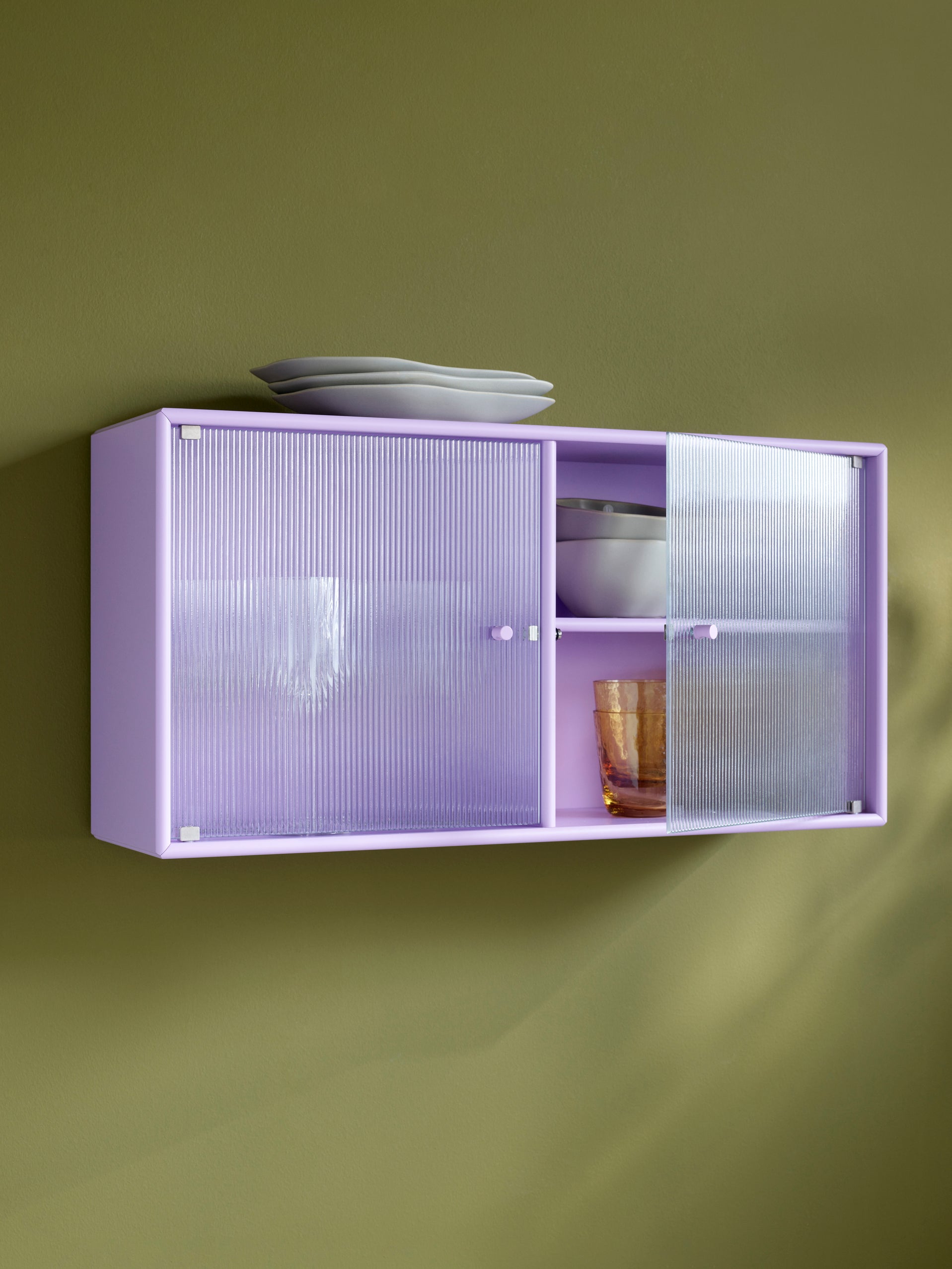
Explore the endless possibilities.
36 modules, 4 depths and 43 colours.
